TIL Layers in CSS
POSTED ON:
TAGS: css specificity
This is hot experimental technology, so all of this is not production-ready.
But I'm so excited by this, I wanted to talk about it.

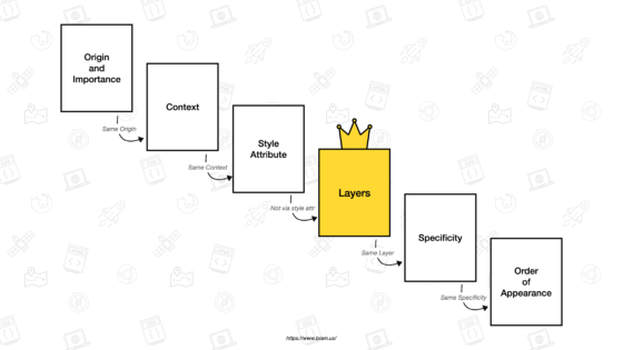
Layers allow us to 'stack' design without having to play that awful CSS specificity rule.
I HATE THIS CONCEPT WITH A PASSION. https://specifishity.com/
tl;dr: CSS goes through a lot of passes to determine style orders. Make the css more specific, and it takes priority. Add a #, and it takes even more priority. Add a freakin' !important;, and hurray, you're at the top.
And if you want to really ruin someone's life:
div.content > #my-link a[type="href"] {
  background: red !important;
}
What's the specificity score on this?
Anybody?
EXACTLY NOBODY F***** KNOWS.
So back to layers --

Layers will appear above specificity rules.
Which also means, this is a opportunity to stop your hacky-ass specificity code and focus more on presentation at a more logical level.
@layer reset;     /* Create 1st layer named “reset” */
@layer base;      /* Create 2nd layer named “base” */
@layer theme;     /* Create 3rd layer named “theme” */
@layer utilities; /* Create 4th layer named “utilities” */

/* or one line version: @layer reset, base, theme, utilities; */

@layer reset { /* Append to layer named “reset” */
  …
}

@layer base { /* Append to layer named “base” */
  …
}

@layer theme { /* Append to layer named “theme” */
  …
}

@layer utilities { /* Append to layer named utilities */
  …
}
Maybe in your base layer, you make 90% of the buttons blue.
On landing pages, you want to stick to a specific theme, so maybe buttons are blue but with a hover effect animation.
And just on two pages, you want the buttons to also have thick borders. So in utilities, you override the borders of the buttons.
You know how powerful that is?
REFERENCE:
The Future of CSS: Cascade Layers (CSS @layer)
Related TILs
Tagged: css